Letterpress Poster Series
Project Type
Typography
Year
2025
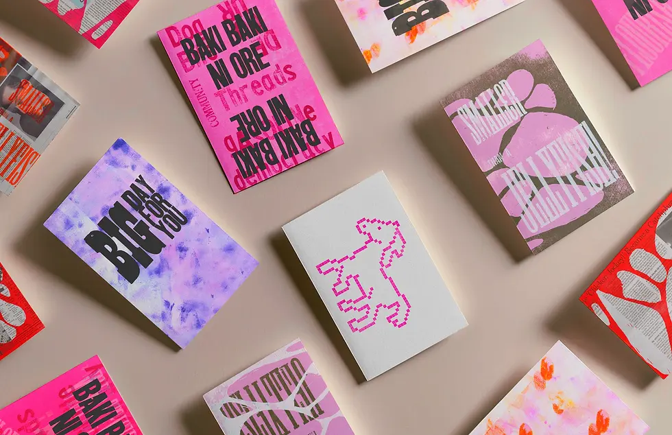
This project explores letterpress as an analog form of communication between friends. Created over four months, this series of posters was made using shared phrases between my best friend and me. The majority of my work as a design student is done on the computer, so I was happy to step away from instant, digital mediums and instead use physical type, ink, and paper as a more deliberate way to maintain connection while living abroad.
Process
During my letterpress exploration, I worked with metal and wooden type, LEGO, brayer rolling, and pressed flowers to explore texture and layering. I was influenced by Amos Kennedy Jr.’s signature approach to layered, vibrant typography, and by the spring blooming around me. Toward the end of the project, I ran out of paper and began printing on newspapers, embracing material limitations as part of the experimentation.
Design
Each poster uses an inside joke shared between my friend and me. Working in letterpress is slow and physical, which was a contrast to how quickly we usually communicate through texting or social media. Taking the time to print each piece made the work feel more intentional and lasting. The series uses typography to maintain a connection across distance.

